Feb 19, 2011
Feb 12, 2011
Giving Text a Motion Effect
Giving Text a Motion Effect
Solution
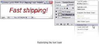
Create your text layer. Use an italic font to enhance the motion effect. Duplicate the
text layer using Ctrl-J (Command-J on a Mac). Right-click (hold Ctrl and click on a Mac)
on the original layer, and select Rasterize from the menu that appears.
Now we’re going to apply a filter to make the text look like it’s moving. Filters can
only be applied to raster layers, which is why we’ve rasterized our original layer.
Select Filter > Blur > Motion Blur to bring up the Motion Blur dialog. To make your text
look like it’s moving horizontally, set the Angle to 0°. Adjust the Distance to a value
that works with your text.
The Basics 1
Opacity of the motion layer in the Layers palette to fade
it out slightly, and used a layer mask to hide the righthand
side of the blur effect so that the text looks like
it’s moving towards the right. (If you need a refresher
on creating layer masks, see the solutions for “Fading
an Image into the Background” in Chapter 2.)
WARNING Raster Right!
.
Making Glassy Text
Making Glassy Text
This solution is very similar to the solution for “Creating a Glassy Button” in Chapter 3.
We’re going to use a combination of layer styles to give our text a glassy effect.
Solution
In the Layers palette, select your text layer and set its fill to 0%. First, we’re going to
add a drop shadow to the text. Open the Layer Style dialog box by clicking on the Add
a layer style button at the bottom-left of the Layers palette, and selecting Drop Shadow
from the menu that appears. Apply the following settings to your drop shadow (you
might need to adjust these depending on the size and type of font you use—in this
example I’ve used Arial Bold and Arial Black, both at 85pt).
Making Glassy Text
Making Glassy Text
This solution is very similar to the solution for “Creating a Glassy Button” in Chapter 3.
We’re going to use a combination of layer styles to give our text a glassy effect.
Solution
In the Layers palette, select your text layer and set its fill to 0%. First, we’re going to
add a drop shadow to the text. Open the Layer Style dialog box by clicking on the Add
a layer style button at the bottom-left of the Layers palette, and selecting Drop Shadow
from the menu that appears. Apply the following settings to your drop shadow (you
might need to adjust these depending on the size and type of font you use—in this
example I’ve used Arial Bold and Arial Black, both at 85pt).
Making Angled Tab Buttons
Making Angled Tab Buttons
In this solution, I’ll show you how to use vector graphic tools to create the angled tab
buttons illustrated below.
Solution
Angled Tab
1 Start with a rectangular vector shape in a color of your choice. I’ve used a light
blue in the image below.
2 Using the Direct Selection Tool (A), select the top left-hand
anchor point of the rectangle. Hold down the Shift key and
move the point to the right by pressing the right arrow once
or twice. Your image should look something like the one at
right. Release the Shift key and use the arrow keys to fine-tune the point. We’ll go
“old school” here and count the number of times we press the arrow key so that
we know how far to move the point on the right-hand side when we get to it.
3 Repeat step 2 for the top, right-hand anchor point.
That’s it—believe it or not, our angled tab button is complete! If you don’t believe
me, look at the finished result below.
Creating Buttons
Feb 11, 2011
Making a Shiny Metallic Button
Making a Shiny Metallic Button
Here, I’m going to show you how to create shiny,
metallic buttons like the ones shown to the right.
I’ll also show you how you can vary their
appearance using different settings.
Solution
1 Create a raster or vector button. I’ve created both
a rounded and rectangular button in this example.
The color of the button is unimportant, as it won’t
affect the final result.
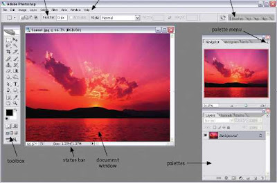
Photoshop workspace

options.bar palette.well
palettes toolbox status.bar document
window
The.Photoshop.workspace
Customizing your Workspace
Subscribe to:
Comments (Atom)


